Welcome to our Tutorials blog post series, where we provide information to help deepen your understanding of what you’re paying for. Today, we’ll be looking at a key element of printed items, Colour for Printing.
Some key elements we will be reviewing are the colour index/bridge, the difference between CMYK and RGB, and why pantone colour may or may not be a good thing.
When designing, we may commonly reference the colour index or colour bridge. An appropriate follow-up question, if you’re someone like me, may be: what exactly are they?
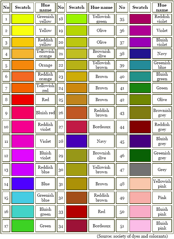
Let’s start with the colour index. The Colour Index (Generic Name; CIGN) uses a series of number to denote a commercial product based on its chemical-based structure. According to the Society of Dyers and Colourists, this includes its “recognised [sic] usage class, its hue and a serial number (which simply reflects the chronological order in which related colorant types have been registered with the Colour Index), e.g. C.I. Acid Blue 52, C.I. Direct Red 122, C.I. Pigment Yellow 176 and C.I. Solvent Black 34.” In this way we can be sure exactly what colour we are getting and what its uses are.

Alternatively, with the CICN (Colour Index Constitution Numbers), when the chemical constitution of a colourant has been publicly disclosed, it is classified a five-figure number (since 1997, that would be a six-figure number). This helps with greater accuracy and clarity in identifying colours. For example, according to the Society of Dyers and Colourists (again), “C.I. Pigment Red 48 (C.I. 15865) is the sodium salt and C.I. Pigment Red 48:1 (C.I. 15865:1) is the barium salt. It should be noted, however, that colon numbers attached to particular generic names do not necessarily coincide with those attached to the corresponding constitution numbers. Also, colon numbers associated with a particular structure may relate to quite different generic names. For example, C.I. 42535 (C.I. Basic Violet 1) is the chloride salt, C.I. 42535:1 (C.I. Solvent Violet 8) is the free base, C.I. 42535:2 (C.I. Pigment Violet 3) is the phosphotungstomolybdic acid salt and C.I. 42535:3 (C.I. Pigment Violet 27) is the copper ferrocyanide salt.”
You got all that? Great! Me neither. All jokes aside, what is important to know is that while this may seem somewhat confusing, designers are well versed in using the colour index and the colour bridge to navigate the world of hues to find the perfect colour for every situation. Speaking of which.

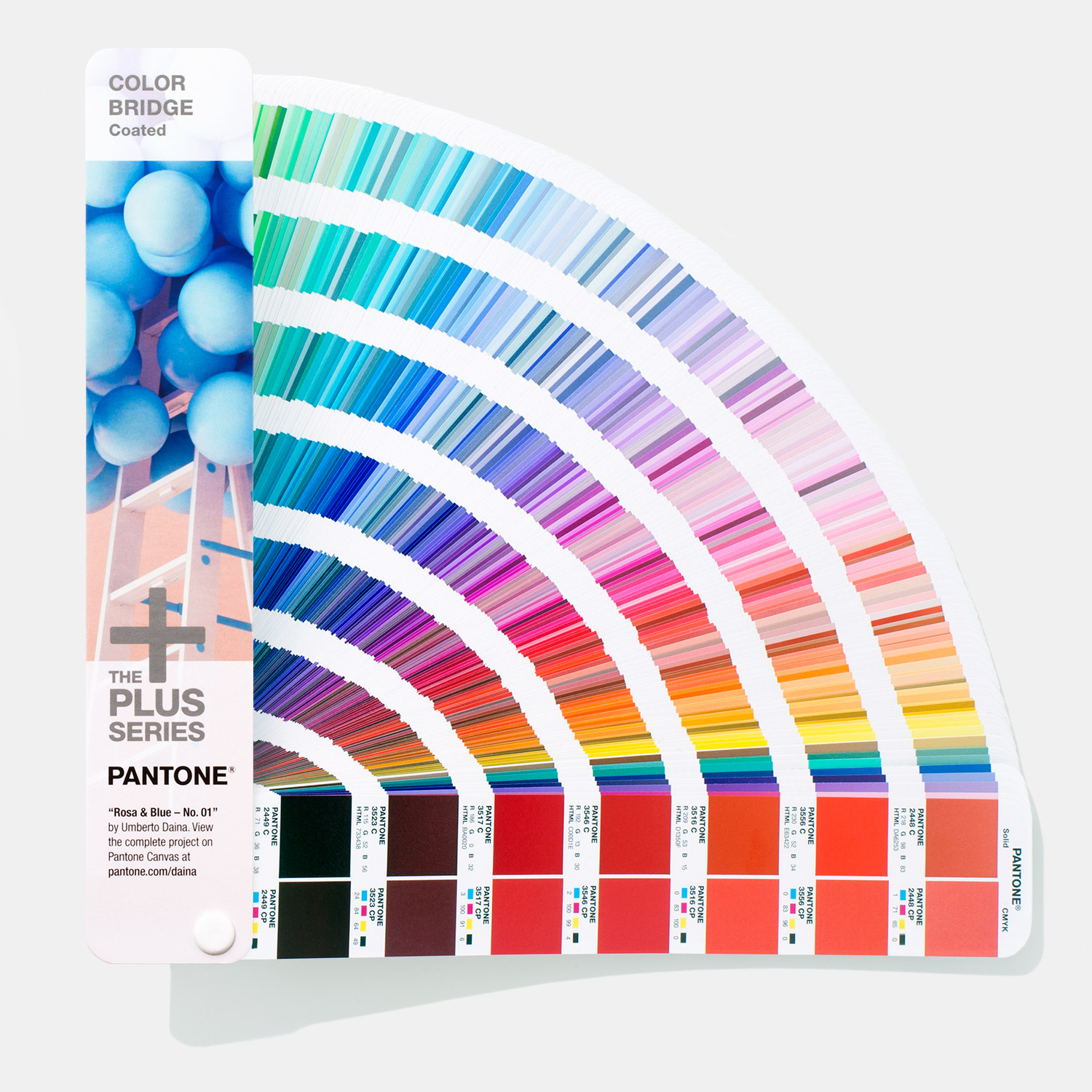
The other way to organize colours is by using a colour bridge. So what is it? Well, from the Pantone website: “The most versatile tool for graphic and digital designers, Color Bridge Set provides a side-by-side visual comparison of Pantone spot colors verses their closest CMYK process printing match on coated and uncoated paper. The guide also includes corresponding CMYK, Hex, and RGB values, perfect for digital designers. Use Color Bridge Set for digital design, animation, and packaging when CMYK printing is required.”
TL;DR? A colour guide is a portable handheld fan deck printed on coated an uncoated paper to compare CMYK, RGB, and other values to each other. It is printed on the most commonly used paper stock weights (100 lb for coated and 80 lb for uncoated) and to ISO Certification so colors can be consistently reproduced. There’s also a lighting indicator page to demonstrate which lighting conditions are suitable for the colours to be evaluated under.
So, why use a colour bridge? Well, it’s uses include for digital design, animation, and packaging when CMYK process printing is required; to visually compare spot colors side-by-side with their process printing equivalents; and as the only guide that offers both HTML and RGB values for graphic spot colors (ex/ for Pantone).
A quick point about Pantone spot printing, as mentioned above: it is high-quality, but also relatively quite expensive. If you’re looking for silver or gold spot printing options, you could certainly do worse than Pantone, but there are alternatives available.
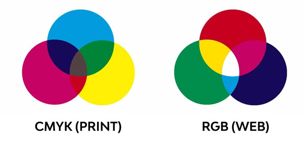
When ordering online, you see the colour you want, you make it your own with design and text, and you checkout. But what you may not know is that what people see on their screen might look very different when printed, due to colouring differences with digital files and the screen. And why is this? It is because what you see on your screen is pixels all coded to fit the RGB index, whereas designers use the CMYK index to create their designs. If you aren’t aware of this, or aren’t aware of how to change the file so that the design you upload will look the way you want it to when printed, then you will likely end up with a product that does not meet your wants and needs, and you may feel as if your time and money have been wasted. When ordering from us, we will check your file before putting the order in to ensure that the RGB design carries over to the CMYK print file. While some other sites do mention all uploaded files should be in CMYK mode, not all customers know that the colour they see on their screen can be a lot different from the actual print. It is a gamble on uploading the correct CMYK file, a gamble you don’t need to worry about taking with us – we’ll ensure your design looks exactly the way you imagined it.

To re-iterate, RGB and CMYK are the two traditional colouring options for print and design, and professional designers use a CMYK colour index (or bridge) to pick their colours so that the printed result won’t have a significant colour difference.
This concludes our Colour for Printing blog post, part of our Tutorials blog post series. For further information on our products, visit our blog, or give us a shout. We hope to hear from you soon!


